Microcopy
Making More with Less
Background
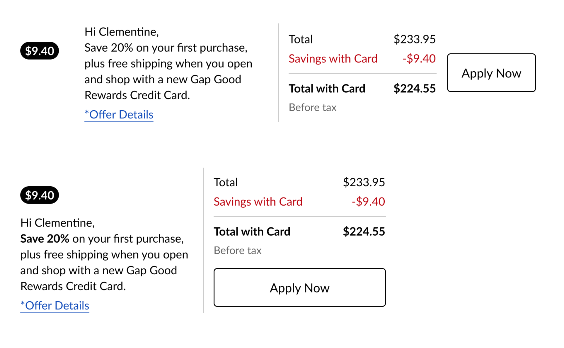
At Old Navy, the savings calculator in a shopper’s bag (pictured below) drove about 20% of online credit card applications but the same content in total (bag and checkout) across brands drove 60-80% of online applications. We focused on bag for Old Navy but there was a significant opportunity.
Using the right language for the right users at the right time is a primary focus of any UX content designer. Loyalty customers at Gap Inc. are the most valuable so making changes to any loyalty program copy required extensive research and cross-collaborative partnership.
Approach
We wondered if simplifying the savings calculator information could help shoppers focus on what matters most: the savings. In addition to my design, business, and brand colleagues, this copy required close partnership with our legal team.
Deliverables
I wrote the most simple copy possible while satisfying two significant requirements: 1) legal approval and 2) minimizing customer friction in what could be a sensitive area (any time money is involved). Old Navy tested versions of the new UI in the shoppers’ online bag for both web and mobile.
Outcomes
After 133 days (longer than usual to allow for phase 1: both challengers and phase 2: red challenger), the red challenger was identified was the most successful.
The estimated impact over the following 12 months is an incremental life of over $2 million (a .27% lift) if we applied just these small copy changes across all four Gap Inc. specialty brands.
Control

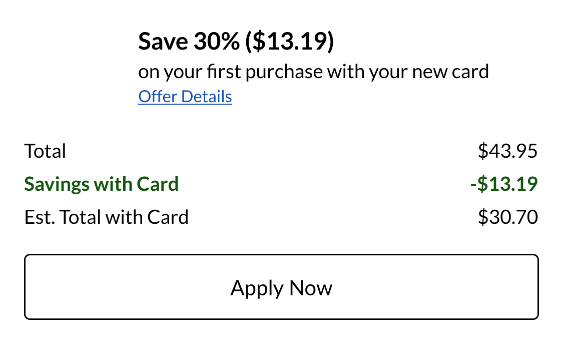
Green Challenger

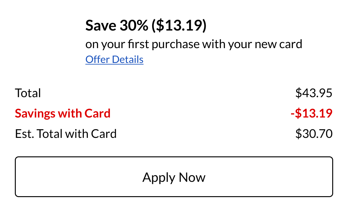
Red Challenger (Winner)