Systems Thinking
Enabling Long-Term Consistency
Background
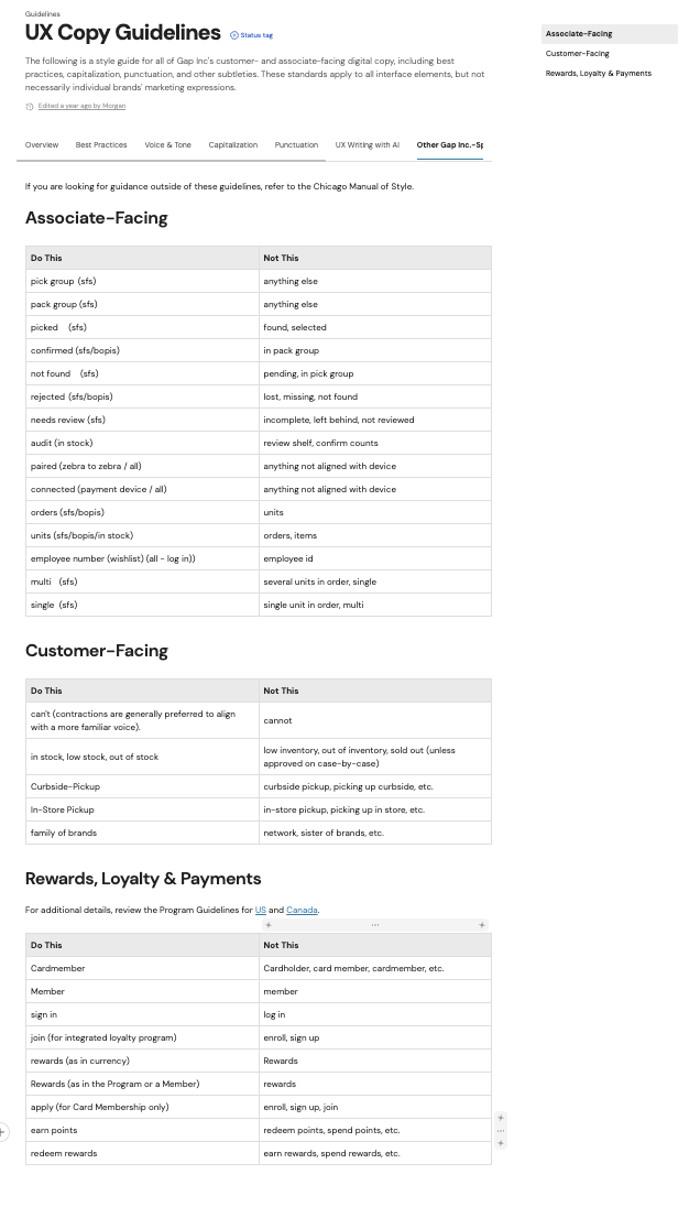
Resources specific to UX copy at Gap Inc. were incomplete. With a robust view across channels, products, and designs I was able to improve the ways the organization spoke with our users by identifying and filling needs used across brands and channels. The first step was to improve UX copy guidelines. While vast details were made available to designers and developers, few included content specifics which lead to inconsistent messaging and formatting across a variety of customer experiences.
Approach
Shortly after starting in UX at Gap, I executed an audit of writing resources which were found across multiple channels. As the guidelines evolved, I was able to consolidate and build resources including company-specific nomenclature, channel-specific recommendations, and voice and tone guidelines.
Deliverables
Our consolidated guide started with the most important thing - it exists where designers, developers, and business partners are. By building tools where partners were used to going, I was able to raise awareness immediately. Additional tools created included a voice and tone map and messaging hierarchy templates which help designers and the brands organize storytelling to equip a user’s decision making.
Outcomes
As a result of this added breadth and consistency, copy and treatment considerations are readily available and serve as a foundation for working with the UX content team. Greater efficiency allowed all cross-functional members of the team to produce more work, more consistently which ultimately reduces friction for the user.
Within the Writing Guidelines
These are a sample of some of the most prominent sections of the UX writing guidelines used by designers and brand creatives at Gap Inc.
Best Practices
A scannable section that provides designers with a high-level understanding of what UX content can and should be at Gap Inc.
Voice & Tone
Although all brands within the organization have their own voice and tone, we often needed an over-arching direction that matched the circumstance. For example, the tone shouldn’t be playful when a shopper comes across a technical error or some other friction.
Capitalization
UX casing guidelines support brands but also provide structure based on how people retain content. Best practices tell us that ALL CAPS can be hard to read and lowercase can add to a brand’s styling in other ways. Our guidelines provided the necessary balance.
Punctuation
Like casing, punctuation is an important part of how a user consumes the content on a page. It can’t be distracting but it must also serve a purpose: every pixel needs to earn it’s space.
Brand-Specific Uses
Like all organizations, Gap Inc. has unique names, phrases, and uses. Consistency leads to familiarity and confidence which is especially important for shoppers navigating across our brands. See more about our brand-authenticity below.
Brand Authenticity
Gap Inc. has global shoppers across platforms and brands. Familiarity is key to a confident experience and authenticity is crucial for all brands.
As the owner of content seen across platforms and brands, I was in the unique position to develop a set of rules that would drive user confidence and their comfort with our brands.
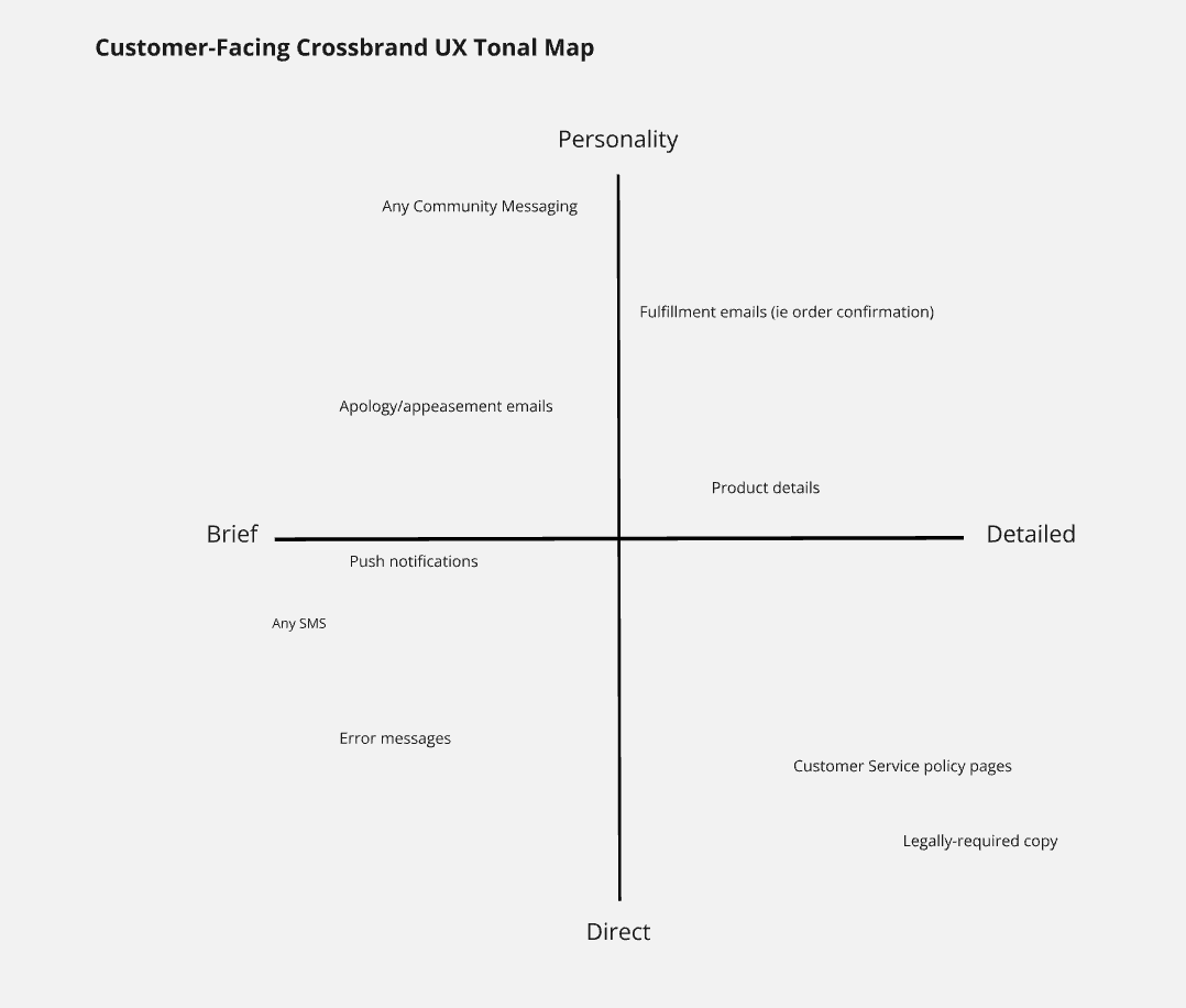
The Importance of Voice & Tone
Recognition and documentation of voice and tone guidelines didn’t exist. While each brand maintained their authentic voice, they needed help identifying when to adjust their tone for the situation.
With a simple visual, I helped UX and brand creatives identify the need to craft content based on several variations.
Storytelling & Decision-Making
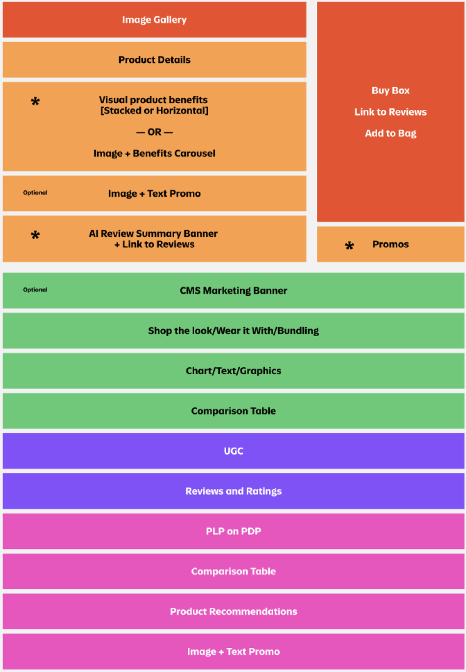
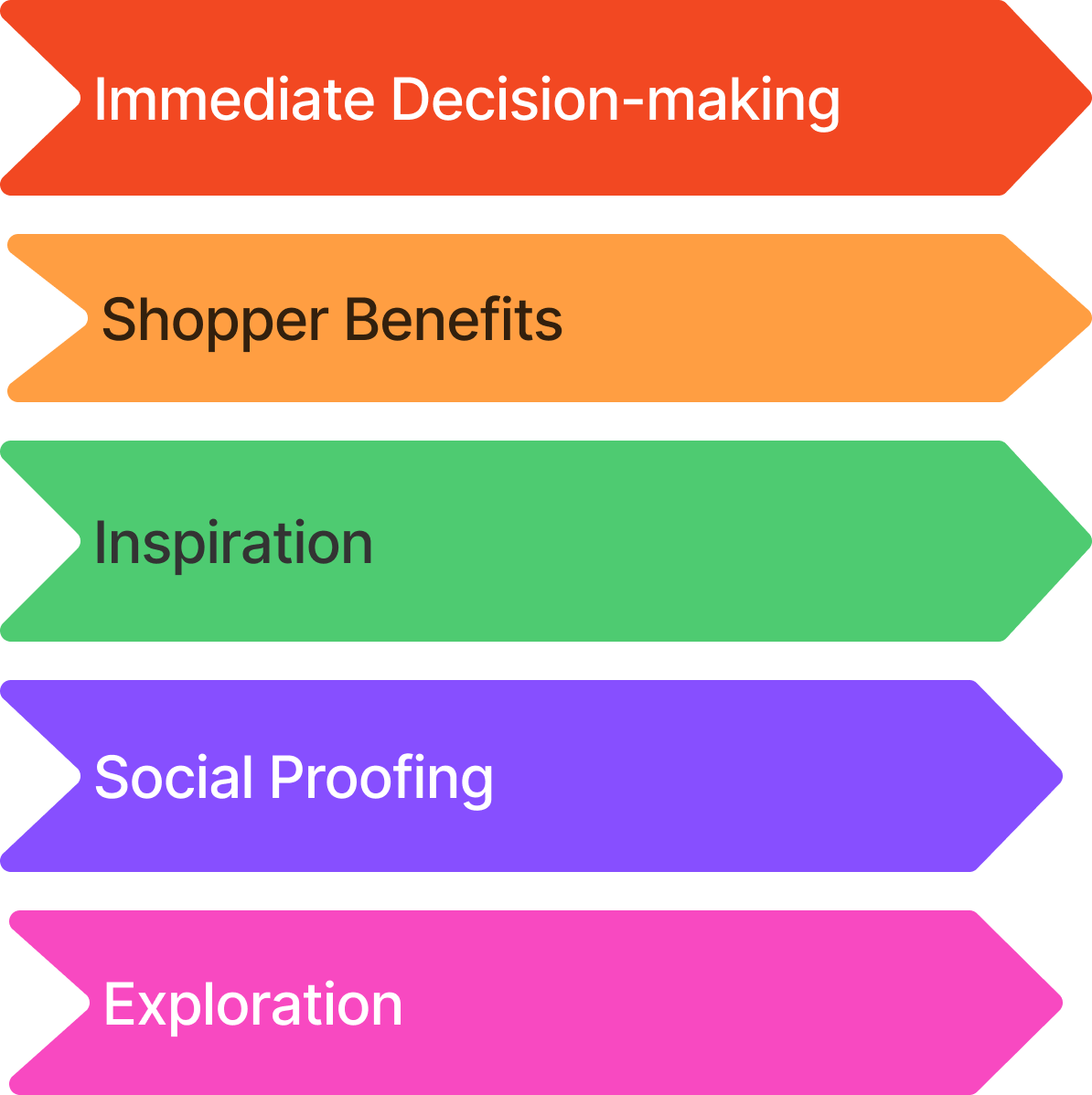
The Old Navy product details page was informative but inconsistent and overwhelming. I helped the brand prioritize content in a way that made sense for the shopper while maintaining brand objectives.
I determined a testable hypothesis based on what I know about our shoppers and best practices. We confirmed which content was most useful for shoppers through user research.